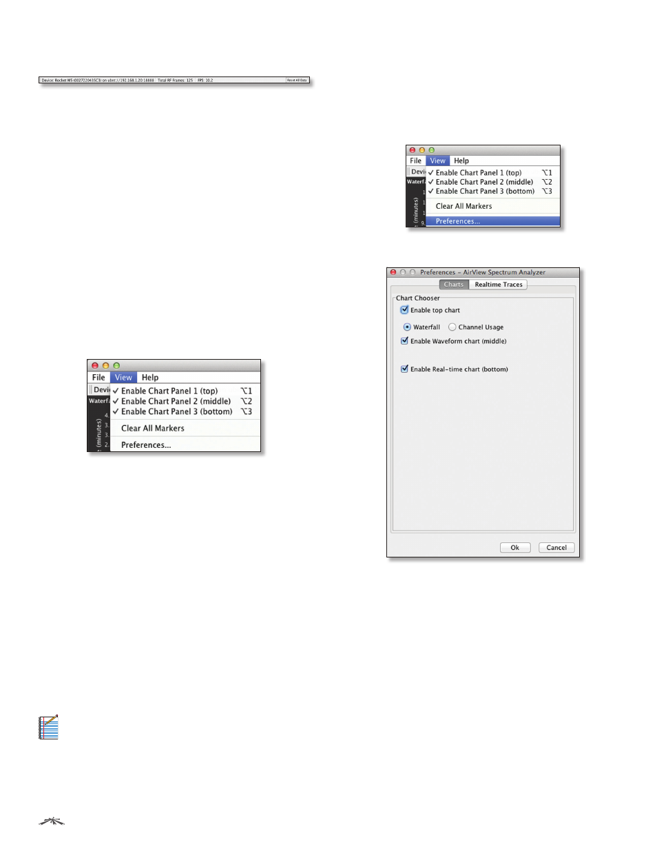
Main view, File menu, View menu – Ubiquiti Networks PowerBridgM User Manual
Page 65

62
Chapter 9: Tools
airOS
™
v5.5.4 User Guide
Ubiquiti Networks, Inc.
Main View
Device
Displays the device name, MAC (Media Access
Control) address, and IP address of the device running
airView.
Total RF Frames
Displays the total number of Radio
Frequency (RF) frames gathered since the start of the
airView session or since the Reset All Data button was last
clicked.
FPS
Displays the total number of frames per second (FPS)
gathered since the start of the airView session or since
the Reset All Data button was last clicked. The wider the
interval amplitude, the fewer the FPS will be gathered.
Reset All Data
Click to reset all gathered data. Use this
option to analyze the spectrum for another location or
address.
File Menu
Click Exit to end the airView session.
View Menu
Enable Chart Panel 1 (top)
Displays the Waterfall or
Channel Usage chart in Chart Panel 1, depending on
which option you have selected in Preferences. This
time‑based graph shows the aggregate energy collected
or channel usage for each frequency since the start of the
airView session.
Enable Chart Panel 2 (middle)
Displays the Waveform
chart in Chart Panel 2. This time‑based graph shows the RF
signature of the noise environment since the start of the
airView session. The energy color designates its amplitude.
Cooler colors represent lower energy levels (with blue
representing the lowest levels) in that frequency bin, and
warmer colors (yellow, orange, or red) represent higher
energy levels in that frequency bin.
Enable Chart Panel 3 (bottom)
Displays the Real‑time
chart (traditional spectrum analyzer) in Chart Panel 3.
Energy (in dBm) is shown in real time as a function of
frequency.
Note:
Energy is the power ratio in decibels (dB) of
the measured power referenced to one milliwatt
(mW).
Clear All Markers
Resets all previously assigned
markers. Markers are assigned by clicking a point, which
corresponds with a frequency on the Real‑time chart.
Preferences
Changes airView settings, such as enabling
or disabling charts and traces, or specifying the frequency
interval.
Preferences
Select View > Preferences to display the Preferences -
airView Spectrum Analyzer window.
Charts
Enable top chart
Check the box to enable the top chart.
Select the desired chart to display in the top chart panel
on the main view. There are two options:
•
Waterfall
This time‑based graph shows the aggregate
energy collected for each frequency since the start
of the airView session. The energy color designates
its amplitude. Cooler colors represent lower energy
levels (with blue representing the lowest levels) in that
frequency bin, and warmer colors (yellow, orange, or
red) represent higher energy levels in that frequency
bin.
The Waterfall View’s legend (top‑right corner) provides
a numerical guide associating the various colors to
power levels (in dBm). The low end of that legend (left)
is always adjusted to the calculated noise floor, and the
high end (right) is set to the highest detected power
level since the start of the airView session.
