Vaisala vLog 4.5 User Manual
Page 87
Adding Horizontal Lines to Graphs
Vaisala Veriteq vLog 4.5
81
Maximum, minimum and average value lines can be added
automatically, or you can customize the lines to add.
To add lines automatically, your graph must only be showing
one unit type, such as temperature or humidity. Maximum,
minimum and average values will be marked, including the
time and date the maximum and minimum were achieved.
You can also add lines manually, such as adding lines to
show when a particular threshold has been reached, or to
add lines to graphs where more than one unit type is
displayed.
To add lines automatically:
From a valid graph, choose
Format | Auto Horizontal
Lines
.
The Graph displays the maximum, average and minimum
values in color-coded horizontal lines. Maximum is shown in
red, average is green and minimum is blue.
If you zoom in on the Graph, the horizontal lines change to
show the maximum, average and minimum values over the
selected time period.
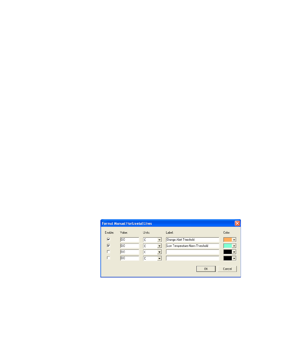
To add lines manually:
1
From a valid graph file, choose
Format | Manual
Horizontal Lines
.
2
In the
Format Manual Horizontal Lines
window, enter the
value, label text, color, and display units for the horizontal
lines to add (up to four colored lines).
Lines appear on the Graph based on the colors, labels, units,
and values you selected.