Button types – Grass Valley NV9654 v.1.1 User Manual
Page 37
27
NV9654
User’s Guide
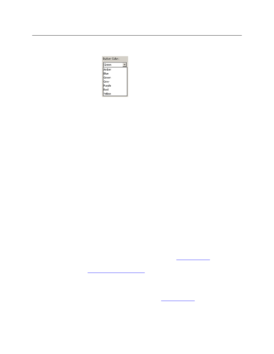
Button Color
A pull-down menu where you can select a button color: amber, blue, green,
grey, purple, red, or yellow:
On the panel, each of the 7 defined colors has two brightness levels: “high-
tally” and “low-tally.” Buttons are dark if their functions are disabled.
Buttons are low tally if they are available and unselected. Buttons are high
tally when they are selected. (An exception to this is the LCD brightness
submenu when the panel is in menu mode.) Some button types are never
high-tally.
Check box
“Place this button on all child pages.” When the operator presses a naviga-
tion button, its target page appears on the buttons. Any page can have
multiple navigation buttons and therefore multiple target pages. If you
check this option, the button you are defining will occur, in the same posi-
tion, on all pages in the subtree available through the navigation button.
A “back” button is a good candidate for such a button. The back button
returns the operator to the previous page. (Back buttons are automatically
placed on list pages and most navigation target pages.)
Check box
“Use custom button text.” This checkbox is not present for all button types.
The option allows you to define specific button text for certain buttons
such as the ‘Src/Dst’ button. By default, the button gets the source name
and destination name as text. The option, when checked, overrides the
default.
Be careful: unchecking this box alters the text you entered.
When you choose a button type, additional drop-down menus can appear, depending on the
button type, allowing you to further specify the button’s behavior. Available options and selec-
tions vary from button type to button type.
There are other button definition options that become available when you are defining a cate-
gory button or a global navigation button and you have defined one or more suffix pages or
global navigation pages. These options are described under
The Navigate button is a special case. It invoking an “Edit Navigate Button” dialog during config-
uration. See
‘Edit Navigation Button’ Dialog
Button Types
Note that different subsets of these button types are available when you are defining a global
suffix template or a global navigation template. See