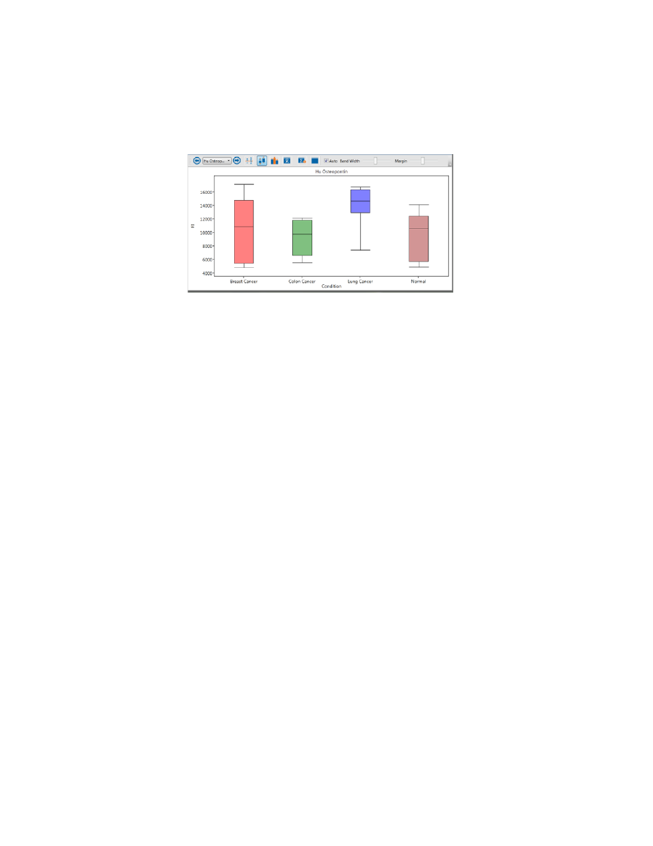
Bar graph – Bio-Rad Bio-Plex Data Pro™ Software User Manual
Page 60

Bio-Plex Data Pro Software User Guide | Analyte Charts and Tables
56
When the Auto checkbox is selected, the plot displays all groups inside the
view port and maximizes the use of the view port. When Auto is not selected,
the Band Width (the width of the individual sample categories) and the Margin
(the width between sample categories) can be adjusted manually.
Hovering over either plot displays detailed information about the object under
the cursor.
Note: Plots display only samples with valid values.
Bar Graph
Bar graphs make it possible to view the graphs of different analytes
simultaneously. You can choose to display selected analytes and filter out
others. Doing so makes it easier to find analytes that have different
expressions across different groups. For example, you can compare one drug
to another to look for a different expression between the drugs. You can view
the results for more than one analyte.
The first analyte in the table is selected by default. You can select other
analytes.
To select an analyte:
•
In the analyte table, click anywhere in the row to select a single
analyte. To select additional analytes, press CTRL and select
additional rows.
•
In the analyte charts and tables pane, select one or more analytes
in the Analytes drop-down list.
