Scatter plot and box and whisker plot – Bio-Rad Bio-Plex Data Pro™ Software User Manual
Page 59

Analyte Charts and Tables
55
The following are additional options available on the toolbar:
•
Analytes — drop-down list of analytes in the data set.
•
Fill — toggle between displaying the dots in the scatter plot as
outlines or filled in.
•
Point Size — changes the size of the dots in the scatter plot.
•
Auto — when selected, controls the band width and margin of the
scatter plot, bar and whisker plot, and bar graph.
•
Band Width — when Auto is not selected, it controls how close the
dots are to one another in the scatter plot. For the bar and whisker
plot and bar graph, it controls the width of the bands.
•
Margin — when Auto is not selected, it controls the distance
between the bands in the bar and whisker plot and in the bar
graph. In the scatter plot, it controls the distance between the sets
of dots.
•
Legend — when selected, a legend appears identifying the
analytes in the bar graph.
Scatter Plot and Box and Whisker Plot
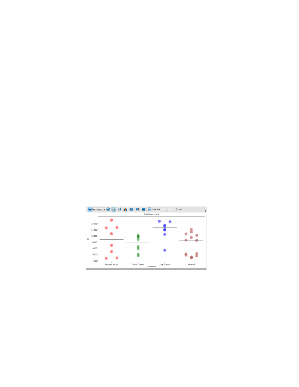
The scatter plot and box and whisker plot display each group of samples as a
category (band) along the horizontal axis. The scatter plot displays each
sample as a point. Points within the same group are artificially spread out
along the horizontal axis in order to minimize overlapping samples.
A box and whisker plot is a quick way of graphically examining the distribution
of points in each group. This plot is particularly useful for comparing
distributions between several groups or sets of data.
The box and whisker plot displays a box from the first quartile to the third
quartile. The bottom and top horizontal bars are the minimum and maximum
sample values, respectively. The horizontal bar within the box represents the
median sample value.
