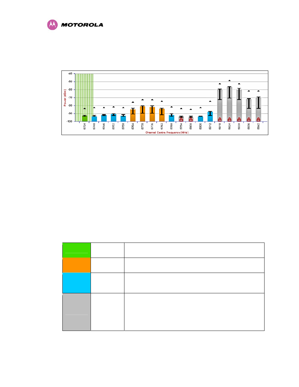
7 local and peer channel spectrum graphics, Local and peer channel spectrum graphics, Figure 58 - sample spectrum management graphic – Motorola PTP 400 Series User Manual
Page 120

118
8.3.8.7 Local and Peer Channel Spectrum Graphics
Spectrum Management presents its computed statistical measurements in a graphical display
on both the master and slave DFS web page.
Figure 58 - Sample Spectrum Management Graphic
The X-axis shows a stylized view of the selectable wireless channels. See section 5 “General
Considerations” for further information. The display separates the display of channels to help
the clarity of the resultant display. The axis is labeled using the channel center frequencies in
MHz.
The Y-axis shows the interference power levels from –100 to –40 dBm.
The active channel (channel 1 in Figure 58) is always marked using hatched green and white
lines. The width of the hatching is directly proportional to the spectral occupancy of the
channel.
The individual channel metrics are displayed using a colored bar, an ‘I’ bar and a peak
symbol. The colored bar represents the following channel state:
Green
Active
The channel is currently in use hosting the Point-to-Point
wireless link
Orange
Interference
The channel has interference above the interference
threshold
Blue
Available
The channel has an interference level below the interference
threshold and is considered by the Spectrum Management
algorithm suitable for hosting the Point-to-Point link
Grey
Barred
The system administrator has barred this channel from use.
Because the low signal levels encountered when a unit is
powered up in a laboratory environment prior to installation
(which makes the grey of the channel bar difficult to see). An
additional red ‘lock’ symbol is used to indicate that a channel
is barred.
Table 12 - Spectrum Management (Non UK) change state key
The top of the colored bar represents the 99.9% percentile metric for specific channel.
