Linknet – LINK Systems LinkNet I User Manual
Page 29

LinkNet
5.3
manual rev 2.1 March 25, 1999
through, exported, or printed from the tool buttons
at the top of the report window. The three sections
in this report are: specific down time code
breakdown, down time code category break down,
and a machine utilization breakdown.
The specific down time code breakdown section
lists each different down time code with the number
of occurrences, the total time, average time per
occurrence, and percent of total time spent in that
down time code. In addition, each different kind of
event is displayed with the number of times it
happened. Events include such things as
run/program switch changes, tonnage overloads, die
protection faults, and other items which do not have
a time interval, but simply a time they happened. A
pie chart is also displayed giving a graphical
representation of the percentage of time each down
time code represents.
The down time code category breakdown
section lists the category, number of occurrences,
total time, average time per occurrence, and
percentage of total down time the category
represents. For instance, both die installation time
and die removal time can be shown separately in the
specific down time code section, but would be
lumped under the “Die Change Related” category in
this section for a higher level view.
The machine utilization breakdown lists the
time, standard rate, actual production rate, strokes
available at the standard rate, actual strokes, and
machine utilization of each die that ran on the
machine (or each machine the die ran on if the report
is by die) and for all dies. Machine utilization is the
actual production rate verses the standard rate.
5.3
Press Performance Overview Report
The press overview report is intended to give a
very high level view of the utilization and uptime of
presses over a given time frame. To generate this
report, select the “Reports” menu, then the “By
Press” submenu, and finally “Performance
Overview” as shown in figure 5.1. A dialog box
similar to figure 5.5 will appear to allow a selection
of the time of interest (see section 5.2 for a
discussion of how this works). After the day, week,
etc is selected, the dialog box of figure 5.6 will
appear with a list of presses and shifts that are valid
for that time period.. Select the presses and shifts
that are to be included in the report and hit the “OK”
button to generate the report.
Information on this report includes:
@
Machine Number and Description.
@
Number of dies run in this time interval.
@
Standard SPM (strokes per minute) for
the press.
@
Actual SPM the press ran, on average.
@
SPM variance between standard and
actual.
@
Press utilization percentage.
@
Press uptime percentage.
5.4
Press Average Tonnage Graph
The average tonnage graph for a press on a past
day can be viewed by selecting the “Reports” menu,
then the “By Press” submenu, and finally “Avg
Tonnage Graph” as shown in figure 5.1. A dialog
box will appear with all the days for which average
tonnage graphs are available. Select the day and
another dialog box will appear with a list of
machines with data on that day. Select a machine
and the graph will appear in a window. In addition,
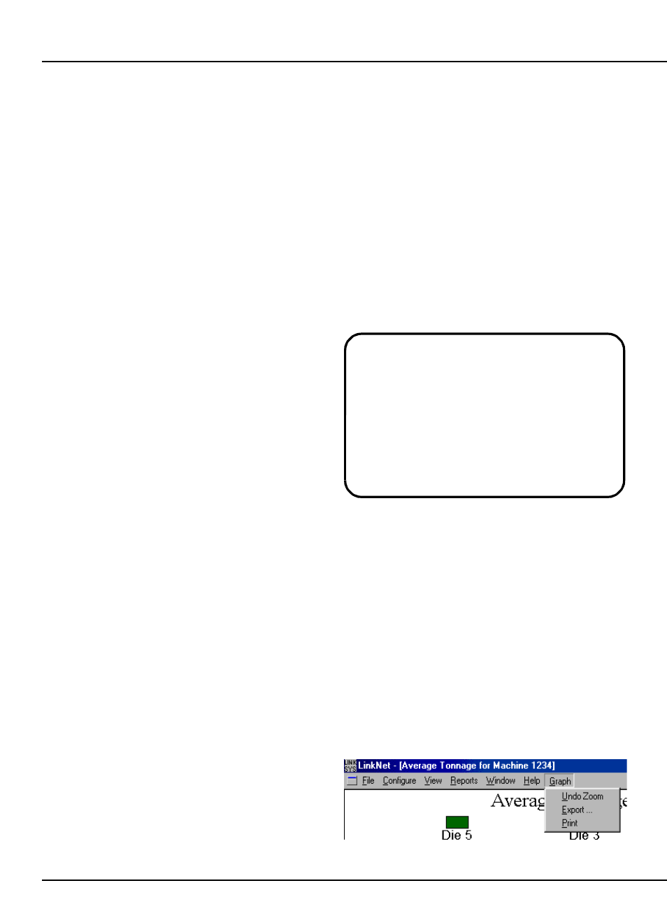
a new menu item, “Graph”, will appear as shown in
figure 5.7.
Figure 5.7:
Graph Menu
Note that the standard SPM (strokes per
minute) and actual SPM of the press are the
time weighted average of the SPMs! For
example, if a die with a standard rate of 100
SPM ran for 2 hours on a press, and another
die with standard rate of 200 SPM ran for 1
hour on that press, the SPM standard for the
press over the 3 hours the dies ran would be
133 SPM.
