Linknet – LINK Systems LinkNet I User Manual
Page 25

LinkNet
4.3
manual rev 2.1 March 25, 1999
Tuesday.
The average tonnage, highest good tonnage, and
lowest good tonnage are collected in 10 minute
intervals (unless a job is changed, in which case the
interval is terminated to keep the tonnages
associated with the correct job).
The highest good tonnage is the highest tonnage
that did not exceed the high setpoint and the lowest
good tonnage is the lowest tonnage that did not go
below the low setpoint. The average tonnage is the
average of all in-limit hits.
This screen shows the average tonnages as an
area graph, the highest good tonnage as a line graph,
and the lowest good tonnage as a line graph. The
average tonnage for each different die run on the
machine appears in a different color.
The graph is arranged by time of day and can be
zoomed if greater detail is desired from a section of
the total graph. To zoom in on the graph, move the
mouse pointer to one corner of the area to zoom in
on, hold down the left mouse button, and without
letting up on the button, move the mouse to the
other corner of the area to zoom in on. When the
mouse is being dragged to the second corner, a
rectangle will show the zoom area. Note that after
a zoom, the graph can be zoomed again to go even
further in. To restore the graph to the full view,
click on the “Undo Zoom” button.
The graph can be enlarged to full screen by
clicking the “Full Screen” button. Hit the ESC key
or click on the title bar to return to the normal view.
To export the graph to a file or clipboard for use
by other windows programs, click in the “Export to
...” button. A window will appear with choices
about where to send the graph.
To print the graph, click on the “Print” button.
The graph will be sent to the default windows
printer.
4.2.3
Production Rate Detail
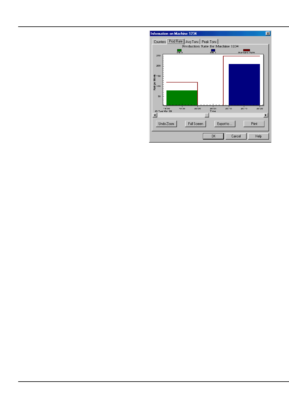
The production rate detail screen (“Prod Rate”
tab - see Figure 4.4) graphically shows the
production rate for a machine for the current day
(see section 4.2.2 for discussion of how current day
is determined).
Figure 4.4:
Example Prod. Rate Detail View
This graph shows the production rate in parts
per minute as an area graph in 10 minute intervals
(unless a job is changed, in which case the interval is
terminated to keep the rates associated with the
correct job). The production rate for each die that
is run that day on the machine appears in a different
color.
The graph is arranged by time of day and can be
zoomed if greater detail is desired from a section of
the total graph. To zoom in on the graph, move the
mouse pointer to one corner of the area to enlarge,
hold down the left mouse button, and without letting
up on the button, move the mouse to the other
corner of the area. When the mouse is being
dragged to the second corner, a rectangle will show
the zoom area. Note that after a zoom, the graph
can be zoomed again to go even further in. To
restore the graph to the full view, click on the
“Undo Zoom” button.
The graph can be enlarged to full screen by
clicking the “Full Screen” button. Hit the ESC key
or click on the title bar to return to the normal view.
To export the graph to a file or clipboard for use
by other windows programs, click in the “Export to
...” button. A window will appear with choices
about where to send the graph.
To print the graph, click on the “Print” button.
The graph will be sent to the default windows
printer.
