Sharpness, Viewing angle test, Beginner | quick & easy calibration – Monoprice 9497 Disney World of Wonder User Manual
Page 7
10
11
In the image below (figure 13), the blue sky should appear deep
and natural. If it appears to be washed out, bring the color level up
slightly.
This image should be colorful and lifelike. If the color and tone are
set properly, then the variety of colors should be clearly different
and complementary (figure 14).
You may wish to move between these images making small
adjustments to color until you are satisfied with the picture’s
accuracy.
(figure 14)*
(figure 13)*
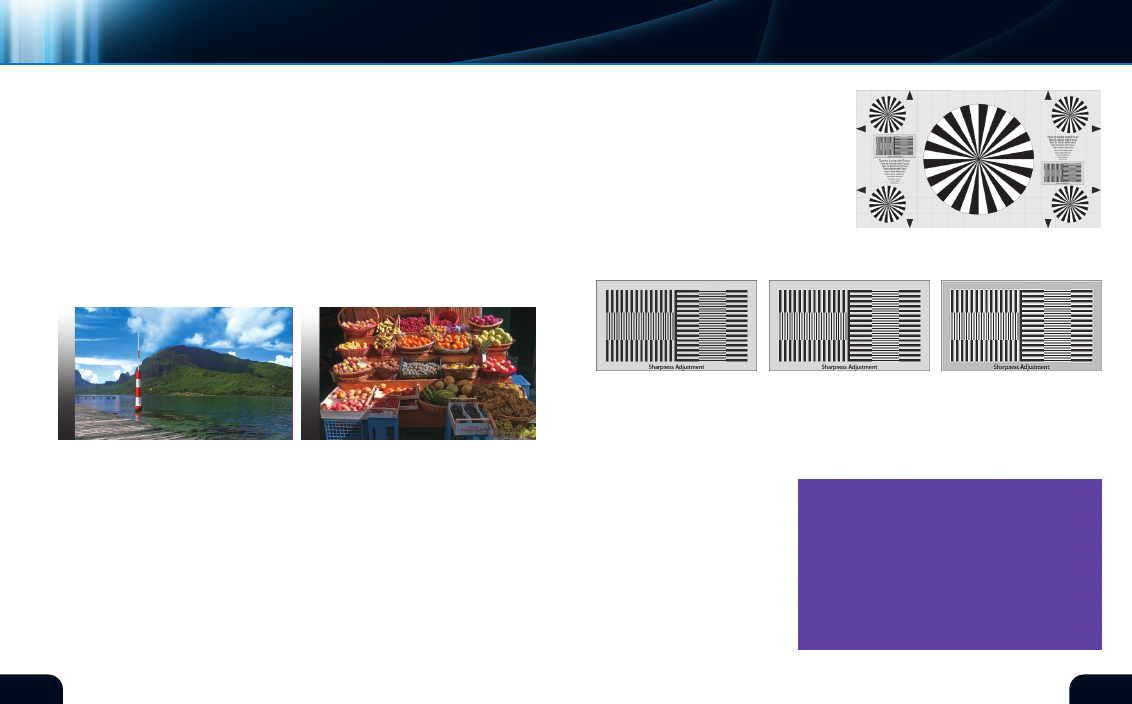
If your equipment has an electronic adjustment for “sharpness,”
use the black and white box patterns and the text to assist with this
setting (figure 15a). The sharpness adjustment is not a substitute
for incorrect optical focus. Sharpness adds a white line around dark
areas to artificially define object edges. This creates the perception
of additional resolution. If used improperly, it can severely impair
the image quality. Observe the chart’s sharpness blocks and the
text while adjusting the sharpness control. The samples below show
some of the effects of adjustments. The
left sample is uncompensated as seen
on the chart. Adding a slight amount
of sharpness will add some desirable
definition to the image as shown in
the center sample. Adding too much
sharpness will begin to add undesirable
edging artifacts as seen below in the
sample on the right (figure 15b).
sharpness
adjustMent
shaRpNEss
ARTIFIcIAl EDGE EnHAncEmEnT
(figure 15b)
Uncompensated
mild Sharpness
Too much Sharpness
beGinner | QUIck & EASY cAlIBRATIOn
video
VIEWING aNGLE tEst
This pattern (figure 16) should
appear as a solid color. The
pattern is intended for use with
flat panel displays and may not
be useful for front projection
equipment. On direct view
cRT equipment, this pattern
will also be useful for detecting
magnetic interference.
(figure 16)*
(figure 15a)
*Digital Reference Standard
*Digital Reference Standard