Plotting measurement data, Figure 4-1, Example: basic two-axis plot format – HP NonStop G-Series User Manual
Page 70: Figure 4-2, Example: basic bar graph format
Formatting Reports and Plots
Measure User’s Guide — 520560-003
4- 10
Plotting Measurement Data
Plotting Measurement Data
Plots are used to compare counters graphically. You can plot data from an active or
inactive measurement data file. You cannot plot data from active counter records or
from multiple data files.
MEASCOM provides two types of plots: two-axis plots and bar graphs. Both types of
plots can be modified using PLOT attributes.
A two-axis plot shows time on one axis and the counter value range on the other. Plot
characters inside the graph mark counter values for each entity at each time. The two-
axis plot is the default plot type when a collection interval is used to collect the data.
.
A bar graph shows the plot character for each entity-counter pair on the vertical axis
and the counter value range on the horizontal axis. Bars of asterisks show average
counter values for each entity-counter pair during the measurement period. (For the
PROCESSH entity, the bars show counter value totals rather than averages.) The bar
graph is the default plot type when a collection interval is not used to collect the data.
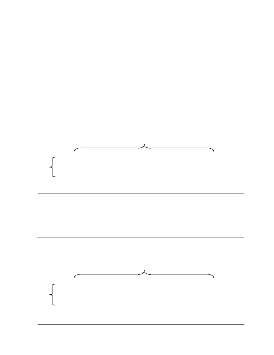
Figure 4-1. Example: Basic Two-Axis Plot Format
Figure 4-2. Example: Basic Bar Graph Format
0:::::+:::20.0::::+:::40.0::::+:::60.0::::+:::80.0::::+:::100
1:00:00 - A C B
2:00:00 - B C A
3:00:00 -B C A
4:00:00 -B A C
5:00:00 - B A C
0:::::+:::20.0::::+:::40.0::::+:::60.0::::+:::80.0::::+:::100
Counter Value Range
Time
VST006.vsd
0:::::+:::20.0::::+:::40.0::::+:::60.0::::+:::80.0::::+:::100
1:00:00 - A C B
2:00:00 - B C A
3:00:00 -B C A
4:00:00 -B A C
5:00:00 - B A C
0:::::+:::20.0::::+:::40.0::::+:::60.0::::+:::80.0::::+:::100
Counter Value Range
Time
VST007.vsd