Optimizing your template for mobile, Working with layout blocks, Add dedicated layout blocks for the mobile version – equinux Mail Designer Pro 2 User Manual
Page 24
Optimizing your template for
Mobile
As your design is now beautifully layouted and packed with
your texts and images, we can now start optimizing your
template for mobile devices such as iPhones and iPads.
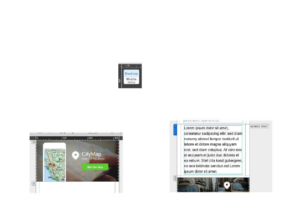
Please access the mobile editing mode by clicking ”Mobile“.
You can switch back by clicking ”Desktop“.
You now see a mobile version of the template we created before. You will
notice that some layout blocks are modified in comparison to there appear-
ance in the desktop editing mode. In general the multiple elements of an
single layout block are orientated vertically in the mobile version instead of
horizontally in the desktop version.
Working with Layout Blocks
Most of the layout blocks added for the desktop version also fit in the mobile
version of your template.
However you might want to have a dedicated image or a different text in the
mobile version. In this case you can add layout blocks that will only appear
in the mobile version of your template.
Add dedicated layout blocks for the mobile version
In order to add a layout block just drag it from the ”Contents” window to
your template like you did before for the desktop version.
On the right side of the layout block you will find a little flag that says
”MOBILE ONLY”. This handle indicates that this particular layout block will
only be displayed if the recipient is reading your newsletter on a mobile de-
vice. The layout block will also not be displayed when switching back to the
desktop editing mode of Mail Designer Pro 2.
24