EdgeWare FastGraph Version 3 User Manual
Page 43
43
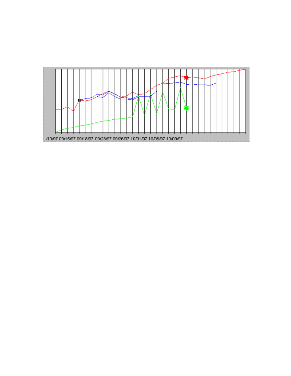
The red NAV line to the right of the * is a 10 day price prediction based on the current
spectrum analysis. You can look at past price predictions by moving the mouse cursor to
any point along the red NAV line and clicking the left mouse button. The ten day price
prediction will appear as a blue line. Here are some examples (in black/white):
Note: When trying to make price predictions the placement of the cursor is very sensi-
tive. Often when you click you may bring up the option to change the NAV line char-
acteristics. We suggest that you only show short time periods, a month is good, when
checking price prediction accuracy. With a little practice you can determine the best
area on the NAV to place the cursor.
You will find that the predictions are poor when the mode is a transition, switching from
cyclic to trending, and from trending to cyclic. Such short term predictions are of limited
use in mutual fund trading.
Using MEM - Summary
Should the NAV moving above or below the trend line be used as specific trading signal?
The answer is an emphatic NO! What the MEM charts can help tell you is if a fund or
index in a trend mode is starting to break down into a cycle mode and may be an indica-
tion to start watching closer if you are in the fund or index. On the other hand, if a fund
or index has been in a trading mode and now the spectrum and Power charts start to move
toward longer dominant periods then you may want to start to consider an entry into a
long position.
The Power and spectrum chart can help determine the quality of a trend. If the dominant
period is at fifty days but you start to see other peaks appear then a change MAY be start-
ing.
Here is another example using Fidelity Select Electronics for nine months ending in Oc-
tober 1997: