EdgeWare FastGraph Version 3 User Manual
Page 42
42
These move along the graph lines as you click the icons.
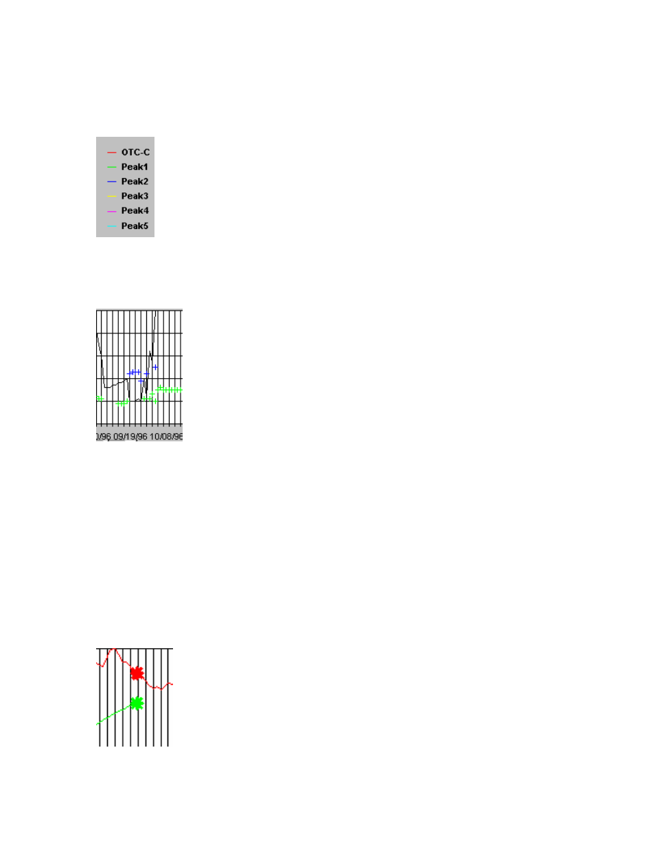
In the lower right corner of the MEM screen you will see:
This is the legend for various peaks in the spectrum. In a trending mode only the red
dominate period will be displayed on the bottom Power chart. As other peaks appear in
the spectrum these will be indicated on the Power chart. For example:
This portion of the Power chart shows the red line indicating what the dominant period is
doing. There are also a few green and red + symbols to indicate that other peaks are pre-
sent in the spectrum but are of lesser power, and hence lesser importance, than the domi-
nate period. When additional peaks start to show on the Power chart it is an indication of
a stronger cycling vs. trending mode. As the spectrum moves toward a trending mode the
extra peaks will start to disappear and finally only the dominant period red line will re-
main.
Price Prediction
The MEM has the ability to make a short term price prediction. FastGraph always shows
a ten day price prediction at the far right of the NAV chart: