EdgeWare FastGraph Version 3 User Manual
Page 19
19
In this example, the + symbols represent test cases holding one fund, and the * symbols
represent three funds. The first thing to notice is the large variation in annual perform-
ance when holding one fund.
It is rather difficult to determine the average effect on return by holding one fund vs.
three funds. However, there is a solution.
Sort
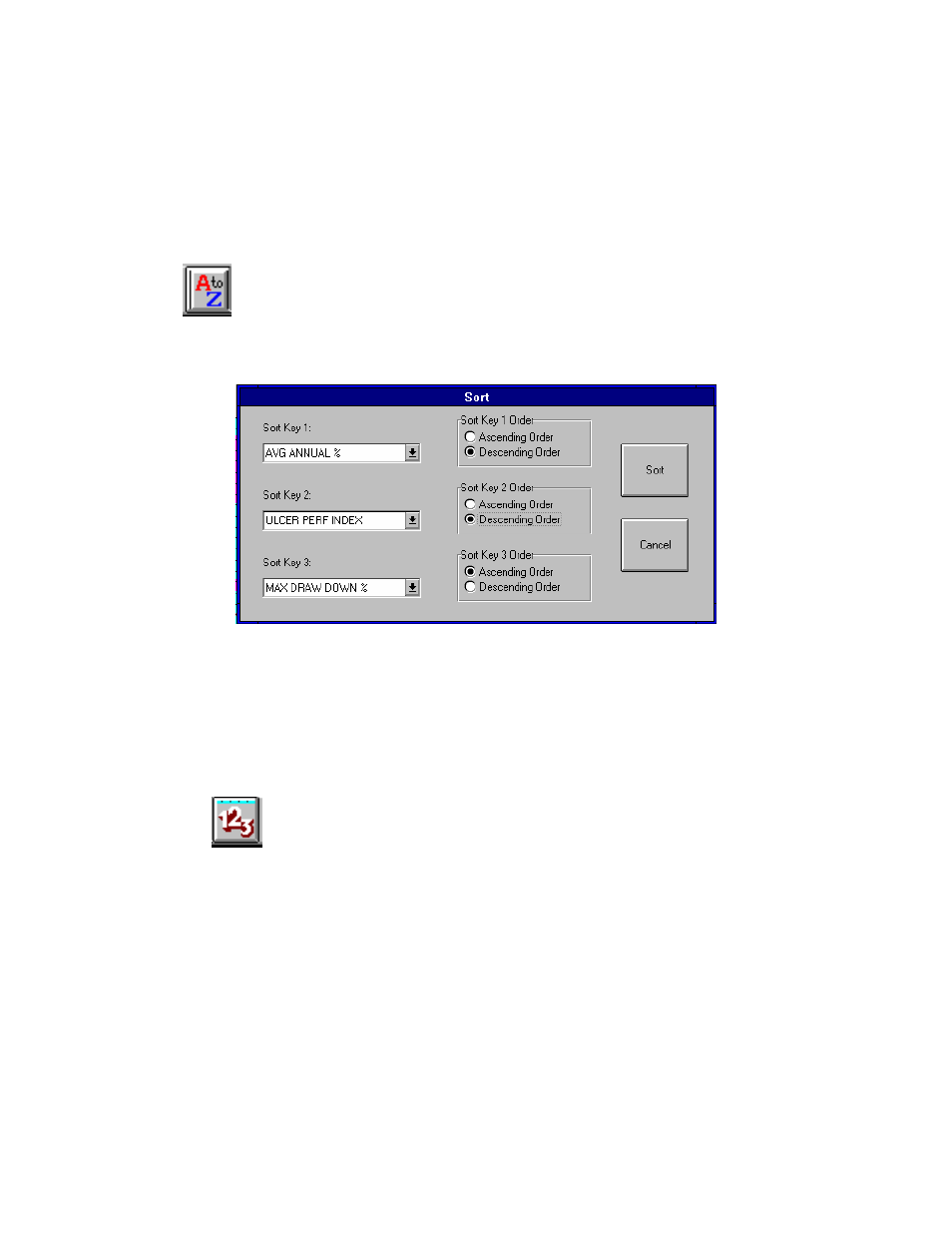
When the Sort icon is selected the following menu appears:
This menu allows you to sort the data in the spread sheet by a variety of criteria. Each of
the sort keys is a pulldown menu. The Sort Keys allow a hierarchy for sorting. In the
above example, the data will be sorted by Avg Annual% first. If two records (test cases)
have the same Avg Annual% then Sort Key 2, Ulcer Perf Index, is used to discriminate
the test cases. Finally, Max Drawdown% is the final sort criteria. You can also sort the
date in Ascending or Descending Order.
Sort All
This icon allows all the spread sheet pages (if multiple files are loaded) to be sorted at the
same time. For example, you may have five different FastBreak Summary files loaded
and want to sort all the sheets of the spread sheet at the same time. This icon will bring
up the same sort menu as shown above.
Select the Sort All icon and sort on Avg Annual % in Descending order. Go to the Main
screen and select XY Line as the Graph Type. Now, graph the sorted data using the
graph icon. You will see the following: