Graph and analysis tools, Analyze data, Graph features and data-analysis tools – Vernier EasyData Guidebook User Manual
Page 37
36
EasyData Guidebook
Graph Features and Data-Analysis Tools
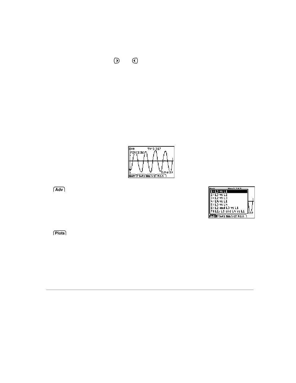
After collecting data, EasyData displays a graph of the data, automatically
scaled for easy viewing. The calculator is placed in Trace mode
automatically so you can scroll through the collected data points on the
graph screen using the and keys
. Several common, data analysis tools
are accessible from the graph screen.
Graph Screen Overview
•
The x-axis (horizontal axis) is the independent variable. For
example, in Time Graph mode this represents time, or in Events with
Entry mode it is a set of user-defined events.
•
The y-axis (vertical axis) is the dependent variable. In all data
collection modes, it is the physical data collected by the attached
sensor.
The Advanced menu enables the plotting of
graphs using data collected from previous
data-collection trials, calculated data, data
entered by hand, or derivatives calculated
during titrations.
When multiple sensors, motion detectors, or photogates are used to
collect data, the Plots menu lists all possible data plots that can be
graphed.