Vernier Graphical Analysis 3 User Manual
Page 12

Graphical Analysis for Windows USER’S MANUAL
14
If you want to automatically populate a column with generated numeric values or special labels (such as months or data
set names), check the Generate Column box in the Column Definition tab. You can then scroll the list for the values or
labels you want.
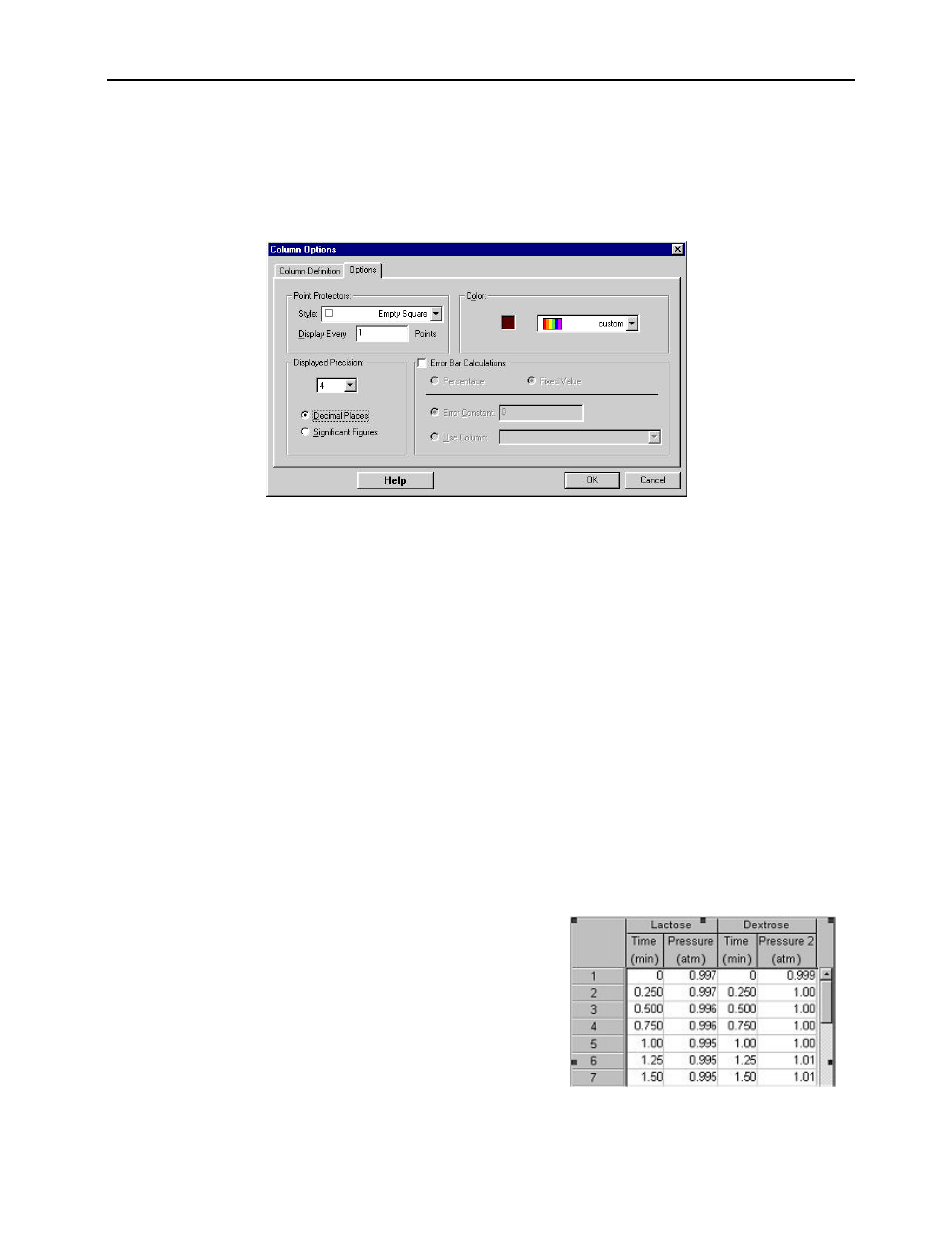
Click the Options tab to change the point protector symbol, the column color, and the size of the error bars. For each
point, you can choose an error constant or you can get the error values from another column. This error number can
then either be interpreted as a percentage of the base value, or as a fixed value.
Changing What Is Graphed on an Axis
To change which columns are plotted on a graph, simply click on the axis label. A pop-up menu listing all the columns
in the data table will be displayed. You can choose what you want graphed on the axis from this menu. Any number of
columns can be plotted on the Y-axis, but only one column may be plotted on the X-axis.
Creating a New Graph
To create a new graph, select Graph from the Insert Menu. There are a number of ways to choose which columns are
graphed: 1. Click on each axis and check a column, 2. Drag a column from the Data Table or 3. Data Browser to the
graph. Changes can be made to this new graph as they were with the first graph. The second graph can be used to display
different columns of data or the same data with different scales and graph styles.
Grouping Objects
Objects may be grouped together. When multiple objects are selected, the group
command causes their relative positions
to be linked, and they can be moved, selected and relatively resized as a single rectangular entity, complete with resizing
handles. Grouping a locked object will make the group locked. Grouping may be nested, that is, a group can contain
other group. Objects can be grouped by selecting more than one object (click on an object, hold down the Shift key, and
click on another object or "Lassoing" by holding down the mouse button and encircling the objects to be selected) and
choosing Group from the Page Menu.
Multiple
Data
Sets
Graphical Analysis data can be stored in multiple data sets. The use
of different sets of data is a good way to compare various
experimental results. For example, the figure to the right shows time
and pressure data for sugar fermentation in two different runs. The
data set on the left was collected using lactose while dextrose was
used for the second data set. In this example, each data set in a Data
Table object contains the same set of columns and each can be
graphed separately. Note that data sets don’t need to have the same
set of columns. When several data sets are combined on a graph,
every set has a different shape point protector, a separate point-to-point line, and separate curve fit lines. Graphing the
various data sets on the same graph provides a convenient way to compare results. You can, however, by checking New
Data Sets have (X,Y) box in Preferences, assign new data sets to have columns labeled X and Y.
