Customizing standard curve plots – Bio-Rad Microplate Manager Software User Manual
Page 49

Analyzing Data Using a Standard Curve
41
To obtain a printed standard table report for the imported standard curve, print the
imported standard curve file separately.
Customizing Standard Curve Plots
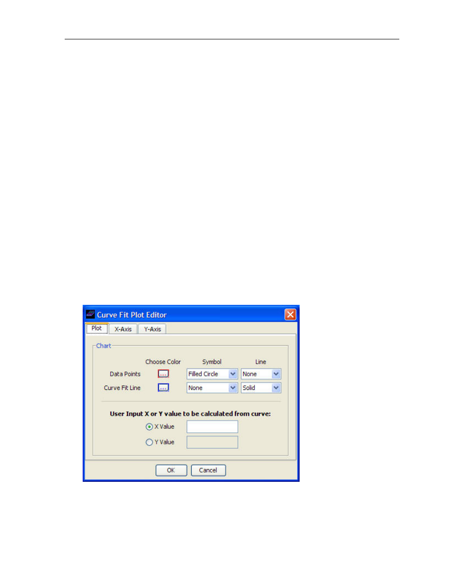
To customize the standard curve plot with axes labels or different X, Y ranges:
1. Click on the Customize Plot icon.
2. In the Plot Editor window, select the Plot Tab, to customize the color of
the lines or point size and choose grid line on or off. In the X-Axis or
Y-Axis windows, you can enter the X-Axis or Y-Axis labels, such as
Concentration or choose Scaling preferences.
3. In the Auto Scale option, the X,Y axes cutoffs are calculated automatically
by the program from the data. The axes are rounded off to provide
reasonable tick marks.
In the Manual Scale option, the user can enter the desired X, Y axes cutoffs.
Select the same axes cutoffs in order to compare similar plots for a given assay. For
log plots, the plot should span full log decades.
When Scientific Label Format is selected, the concentrations will be listed as
1.0E2, 1.0E3, etc. instead of 100, 1000, etc. The option is useful for very large
concentration ranges.
