Calls-to-action front and center – Google PRINCIPLES OF MOBILE SITE DESIGN: DELIGHT USERS AND DRIVE CONVERSIONS User Manual
Page 7
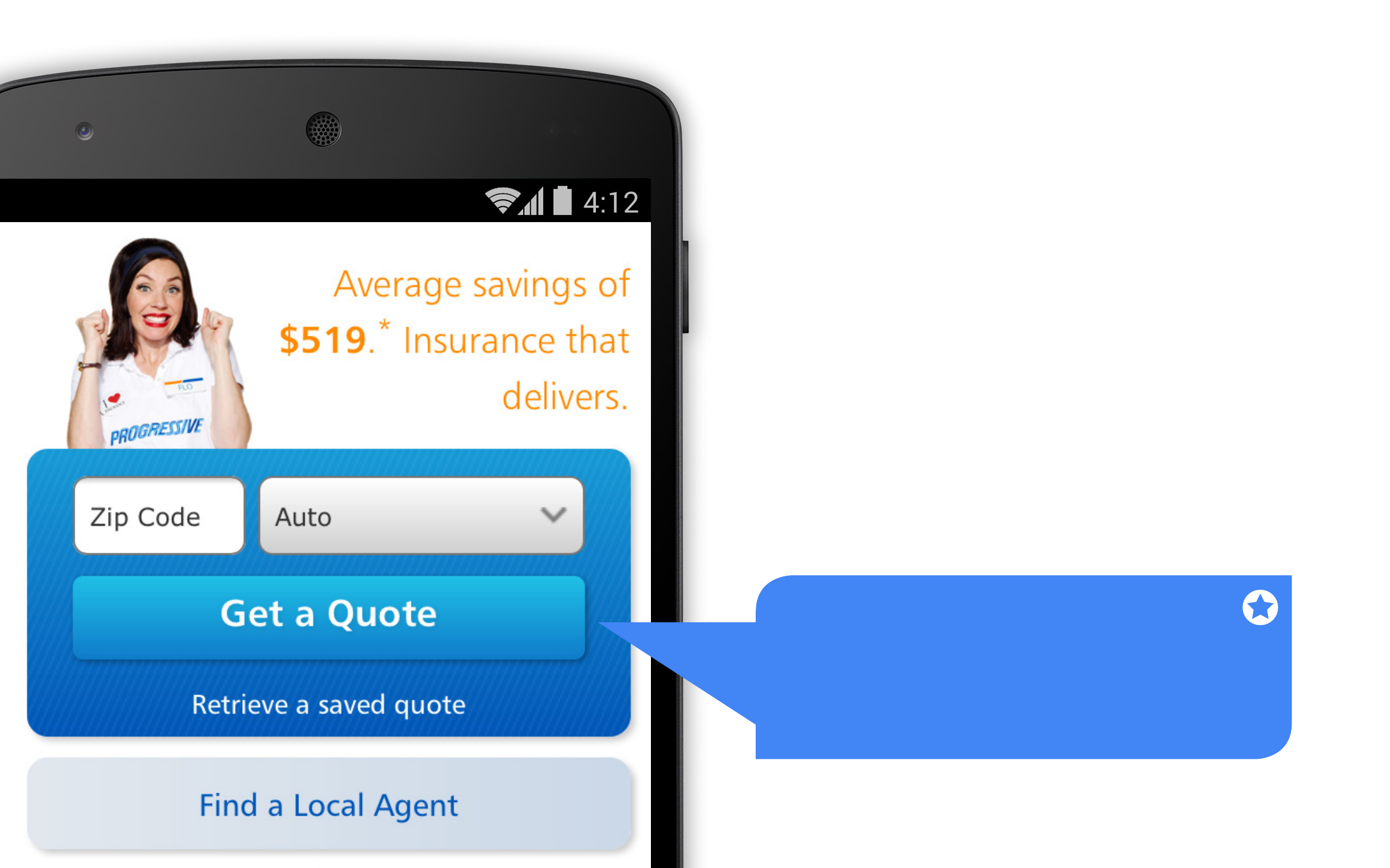
1. CALLS-TO-ACTION
FRONT AND CENTER
It can be easy for mobile users to miss menu items,
so always put your key calls-to-action where you
know users will see them. Study participants had
the easiest time completing tasks on sites that
clearly displayed primary calls-to-action in the main
body of the site, with secondary tasks available
through menus or below the fold. Your mobile
calls-to-action will probably be different than on
desktop, so put yourself in your users’ shoes when
determining placement.
Example from Progressive Mobile Site.
Key Takeaway
Feature your primary calls-to-action
in your most prominent site space.
07
See also other documents in the category Google Software:
- Message Archiving Administration Guide (79 pages)
- Apps Technical Transition Guide For Business, Education, and Government (56 pages)
- Message Continuity User Guide (5 pages)
- Search Appliance User Experience Guide (31 pages)
- Apps Directory Sync Administration Guide (146 pages)
- Earth User Guide (131 pages)
- Android 2.3.4 Users Guide (384 pages)
- Android 3.0 Users Guide (140 pages)
- Galaxy Nexus Android mobile technology platform 4.0 Users Guide (107 pages)
- Anywhere+ Deployment Guide V1.0.1 (51 pages)
- Activation Guide Message Filtering (46 pages)
- DoubleClick Rich Media Guide to Rich Media Innovation (4 pages)
- Remarketing in AdWords Seven-Minute Setup Guide (4 pages)
- Grants Beta A BEGINNERS GUIDE (13 pages)
- Search Appliance OneBox for Enterprise Developers Guide (30 pages)
- Search Appliance Feeds Protocol Developers Guide (45 pages)
- SketchUp: Getting Started (2 pages)
- Agency Product Guide (2 pages)
- Changes to AdWords Reporting A Comprehensive Guide (13 pages)
- Search Appliance Connectors Administration Guide (41 pages)
- Search Appliance Guide to Software Release 7.0 (10 pages)
- DTorial: An interactive tutorial framework for blind users in a Web 2.0 world (14 pages)
- Networking Best Practices for Large Deployments (42 pages)
- Apps Migration for Lotus Notes Installation & Administration Guide (100 pages)
- Understanding Visualization by Understanding Individual Users (5 pages)
- Web Security for Enterprise Administration Guide (83 pages)
- Education – access infrastructure guide (11 pages)
- Message Continuity Setup and Administration Guide (33 pages)
- Search Appliance Getting the Most from Your Google Search Appliance (77 pages)
- Search Appliance Getting the Most from Your Google Search Appliance (82 pages)
- Commerce Search Deployment Guide (29 pages)
- Apps Migration for Microsoft Exchange Administration Guide (78 pages)
- Grants Ongoing Management Guide (26 pages)
- Custom Search Engine (beta) Starter Guide (8 pages)
- Search Appliance Policy ACL API Developers Guide (24 pages)
- Search Engine Optimisation Starter Guide (22 pages)
- Website Optimizer v 1.0 The Techie Guide (26 pages)
- Search Appliance Creating the Search Experience (141 pages)
- Apps Security and Compliance Services Web Services Application Programming Interface Guide, Early Access Version 1.5 (70 pages)
- Message Security Batch Reference Guide (561 pages)
- Message Archiving Microsoft Exchange Journaling Configuration Guide For Exchange Server 2007 and 2010 (33 pages)
- Search Appliance Authentication/Authorization for Enterprise SPI Guide (33 pages)
- AdMob Case Study TV Guide Digital (2 pages)
- Apps Connector for BlackBerry Enterprise Server Installation and Administration Guide (70 pages)