Working with the data graph – Dwyer GDL-T User Manual
Page 11

DwyerLog User’s Guide
Version 1.4x
11/33
Working With the Data Graph
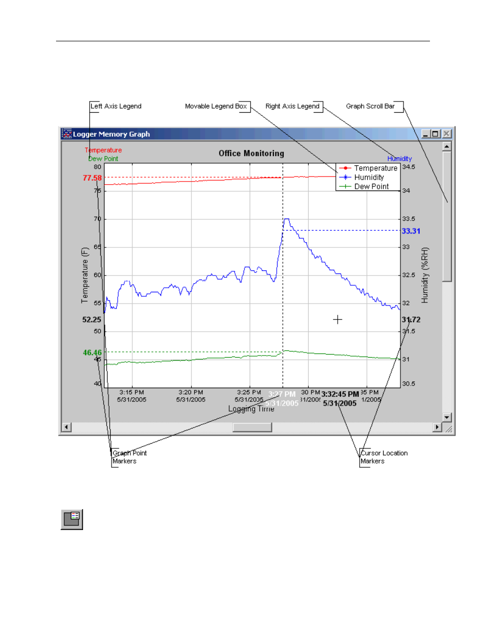
Clicking anywhere within the graph window activates the graph toolbar buttons and the graph window features.
• The graph plots each data channel using a different color and dot style. A small rectangular legend shows the color
and the dot style of each channel. This legend can be moved by clicking the left mouse button while inside the
legend and dragging the legend to where you want it to be. The legend can be turned ON and OFF by pressing the
button on the toolbar.
• There is an additional legend above each of the Y axis. This legend is the channel name drawn in the same color as
the channel line on the graph. This legend helps identify which channel belongs to which axis. For instance, in the
graph above, the
Temperature
in red and
Dew Point
in green correspond to the left Y axis, the
Relative Humidity
in
blue corresponds to the right Y axis.
- DPMX (2 pages)
- DPMP-4 (2 pages)
- DPMP-5 (2 pages)
- DPML-4 (2 pages)
- DPML-5 (2 pages)
- DPMW (2 pages)
- MPM (36 pages)
- SPPM-HSG (1 page)
- SPPM (4 pages)
- SPPM-C (4 pages)
- A-SPPM-TC (2 pages)
- ULB (18 pages)
- CRF2 (4 pages)
- CLT (2 pages)
- PBLT2 (1 page)
- PBLTX (4 pages)
- SBLT2 (1 page)
- SBLTX (4 pages)
- MBLT (2 pages)
- FBLT (2 pages)
- ULT (8 pages)
- UTC (20 pages)
- ULTM (20 pages)
- ULSL (30 pages)
- 1500 (16 pages)
- 2600 (52 pages)
- 2500 (16 pages)
- 16A (1 page)
- 16A (44 pages)
- 1600 (8 pages)
- 1600 (36 pages)
- 8600 (40 pages)
- 8C (6 pages)
- 32B (32 pages)
- SCZ10 (20 pages)
- 8C (24 pages)
- 32A (36 pages)
- 32DZ (40 pages)
- SCD (10 pages)
- SCD-PS (2 pages)
- SCD-8 (2 pages)
- SCD-LED (2 pages)
- 650 (2 pages)
- 651 (2 pages)
- 659RTD (2 pages)
