General Tools and Instruments CIH20DL User Manual
Page 19
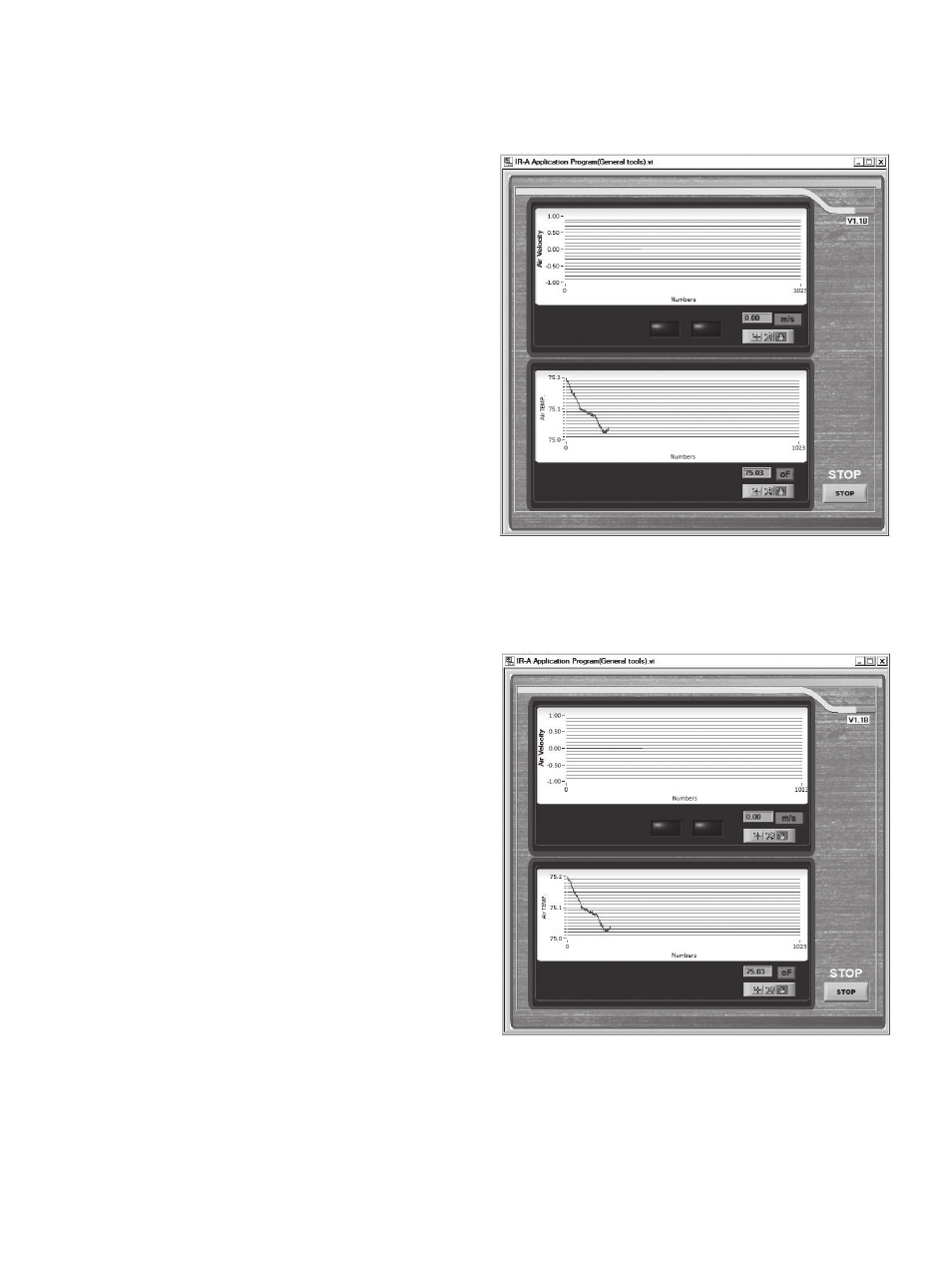
Viewing Record Data Graphically
You can also view Record data by using the
dashboard’s integrated chart function. With the
meter connected to your computer (indicated
by a green light at the upper left of the
dashboard and the word
LINK on the bottom
line of the meter’s LCD, click on the
OPEN
virtual button under
CHART at the bottom of
the dashboard. A screen similar to Fig. 12 will
appear on your computer’s display. Note that
only two parameters (air velocity and air
temperature) are plotted because they are the
only values that the meter captures
automatically when powered on and operating
unattended in Data Logging mode. The IR
temperature data contained in the tables
generated by uploaded .txt/.xlsx Data Record
files are not plotted.
The dashboard’s chart function is useful for
quickly viewing trends in ambient air speed
and temperature values captured by the probe
since the meter was last powered on. Unlike
Record data, the data in plots generated by the
dashboard’s chart function are not—and
cannot be—given absolute date and time
stamps.
You can, however, make this plotted data
easier to correlate with tables of uploaded
Record data by changing the plots’ x-axis label
via the dashboard. To do so, right-click on any
of the three icons in the graph palette (below
the m/s and °F buttons shown in Fig. 12).
Using the pulldown menu, select
Visible
Items, and left-click Scale Legend to put a
check mark to its left. You can also change the
units of the air speed and temperature plots by
clicking their red virtual buttons. As an
example, compare Fig. 13 to Fig. 12. On Fig.
13, the scale legend has been changed from
Numbers to Sample No., and the unit of air
speed measurement has been changed from
m/s to ft/min.
19
Fig. 12. The initial CHART display,
activated from the dashboard
13. A modified CHART display
CIH20DL-FINAL-122111_awb 12/21/11 9:58 AM Page 19