Creating schemes – TEKVOX TekTouchPad User Manual
Page 15

TekTouchPad Configuration User’s Guide
15
TEKVOX, Inc.
Creating Schemes
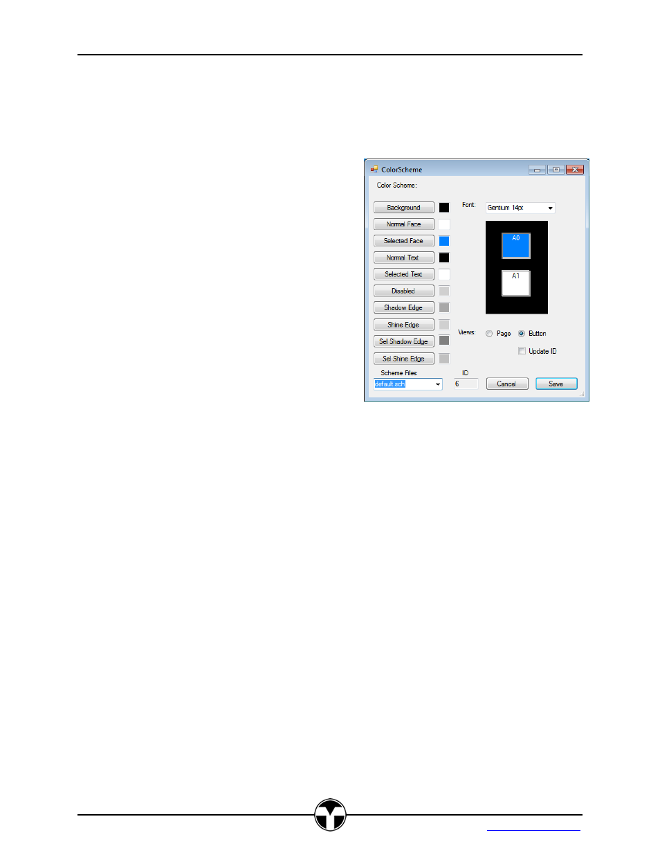
Creating color schemes is one of the powerful features of the TekTouchPad and is accessed by
selection of the menu items “Resources” sub-item “Color Schemes”. The default scheme loaded
as shown gives a starting place for new scheme creation. A Scheme can be edited and saved to
a new file name. Any Scheme file within the project
directory will automatically load into the project. Any
other existent scheme may be loaded using the
“Scheme File” selection at the bottom of the dialog.
The scheme creation dialog allows for two views,
the button view (default) and the panel view. The
button view display what the button would look like
in both pressed and not pressed states. The panel
view displays what a complete panel of 8 buttons
would look like displayed on the TekTouchPad.
When a scheme element is selected for editing, a
color dialog appears allowing for selection of a color
or definition of a custom color. Each of the scheme
elements is described below:
Note: The TekTouchPad utilizes 16 bit RGB 565 color definition, and translates between the 24
bit and 16 bit orientation. This may result in the actual displayed color potentially being off from
the originally selected color. It is best to test the created colors on a single button of the actual
unit prior to full panel definitions.
Background – Defines the background color of the button page. Each button
page may have a different color if so desired. The background color is only used
for page schemes selected from the main window.
Normal Face – Defines the button face color in an off state.
Selected Face – Defines the button face color in a pressed state.
Normal Text – Defines the color used for the normal face text color in an off
state.
Selected Text – Defines the color used for the selected pressed button face text
Disabled – Defines the color used for a disabled button
Shadow Edge – Defines the color used for in an off state shadowed edge. This
edge is usually the bottom edge of a non-pressed button, and is darker than the
shine upper edge.
Shine Edge – Defines the color used for in an off state button shining edge. This
edge is usually the top edge of a non-pressed button, and is a lighter shade of
the shadow edge color.
Set Shadow Edge – Defines the color used for a selected pressed button
shadowed edge. This edge is typically the top edge of a selected button, and is a
