6 custom reports – Campbell Scientific VisualWeather Software User Manual
Page 28
VisualWeather
™
Software
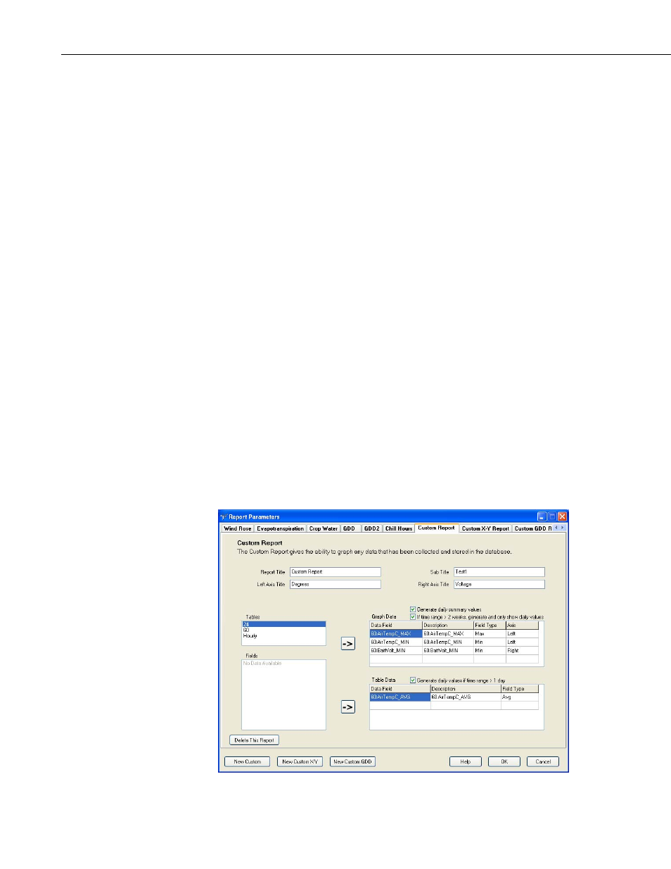
7.2.6 Custom Reports
Custom reports are available that let you plot one or more traces on a graph
and/or monitor one or more data values in a table. To create a custom report,
press the New Custom button on the Custom/Edit Reports screen.
The Report Title and Sub Title fields are used to provide headings for the
graph. The Left and Right Axis Description fields are used to provide a label
for each axis.
The tables that are being collected to the database are listed in the Tables field.
When a table is selected from this list, the data values in that table appear in
the Fields list.
Highlight a data value from the list and click the top right-pointing arrow (or
double-click the value) to add it to the list of values to be graphed. The type of
output for the data value can be specified by clicking the cell within the Field
Type column to display a list box of output types (Max, Min, Avg, Sample, or
Other). To specify whether the value is plotted on the right or left axis of the
graph, click within the Axis cell and select Right or Left from the list box that
is displayed. A data value can be deleted from the list of values to be graphed
by right-clicking and choosing Delete. Selecting Generate daily summary
values will cause daily summary values to be shown on the graph. For
example, if a maximum air temperature is being graphed, the daily maximum
air temperature will be indicated on the graph. Selecting If time range > 2
weeks, generate and only show daily values will cause only daily values to
be graphed if the time range for the report is greater than two weeks.
Highlight a data value from the list and click the bottom right-pointing arrow
to add it to the list of values to be monitored in the table. Selecting Generate
daily values if time range >1 day will cause only daily values to be monitored
if the time range for the report is greater than one day.
18