Character / background contrast, Ambiguous characters, Character quality – Rockwell Automation 5370-OCR2 PAK User Manual
Page 16
Chapter 2
Introduction to OCR2-PAK
2–8
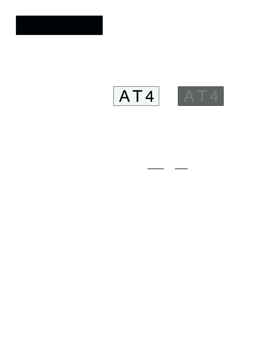
The contrast between the inspected characters and the surrounding
background must be great enough so that, when configuring the OCR Tool, a
threshold can be set to effectively distinguish the inspected characters from
the background.
Good Contrast
Poor Contrast
There are several valid characters that can confuse OCR systems. Some
numbers can be misread as letters and some letters can be read as numbers.
Misreads are more likely to occur when the print quality is poor. The most
ambiguous number and letter pairs are:
Number
Letter
0
1
2
5
8
O
I
Z
S
B
To prevent confusion between these characters, we recommend that you:
•
If possible, don’t use ambiguous characters in the same string.
•
Use a different font. Some fonts have very little differences between
characters. For example, in the Courier font the lowercase L (
l
) and the
number (1)
1
are almost identical.
•
Train the character templates carefully to reduce confusion between
similar characters.
The quality or clarity of the inspected characters affects the success of the
character recognition. Extra markings or breaks in characters can result in
failed or incorrect recognition of a character. You must determine if the
variation in characters is acceptable and adjust the taught font characters
accordingly.
Character /
Background Contrast
Ambiguous Characters
Character Quality