Measurement Computing DASYLab User Manual User Manual
Page 35
Chapter 3
Visualizing Measurements
3-6
|
dasylab.com
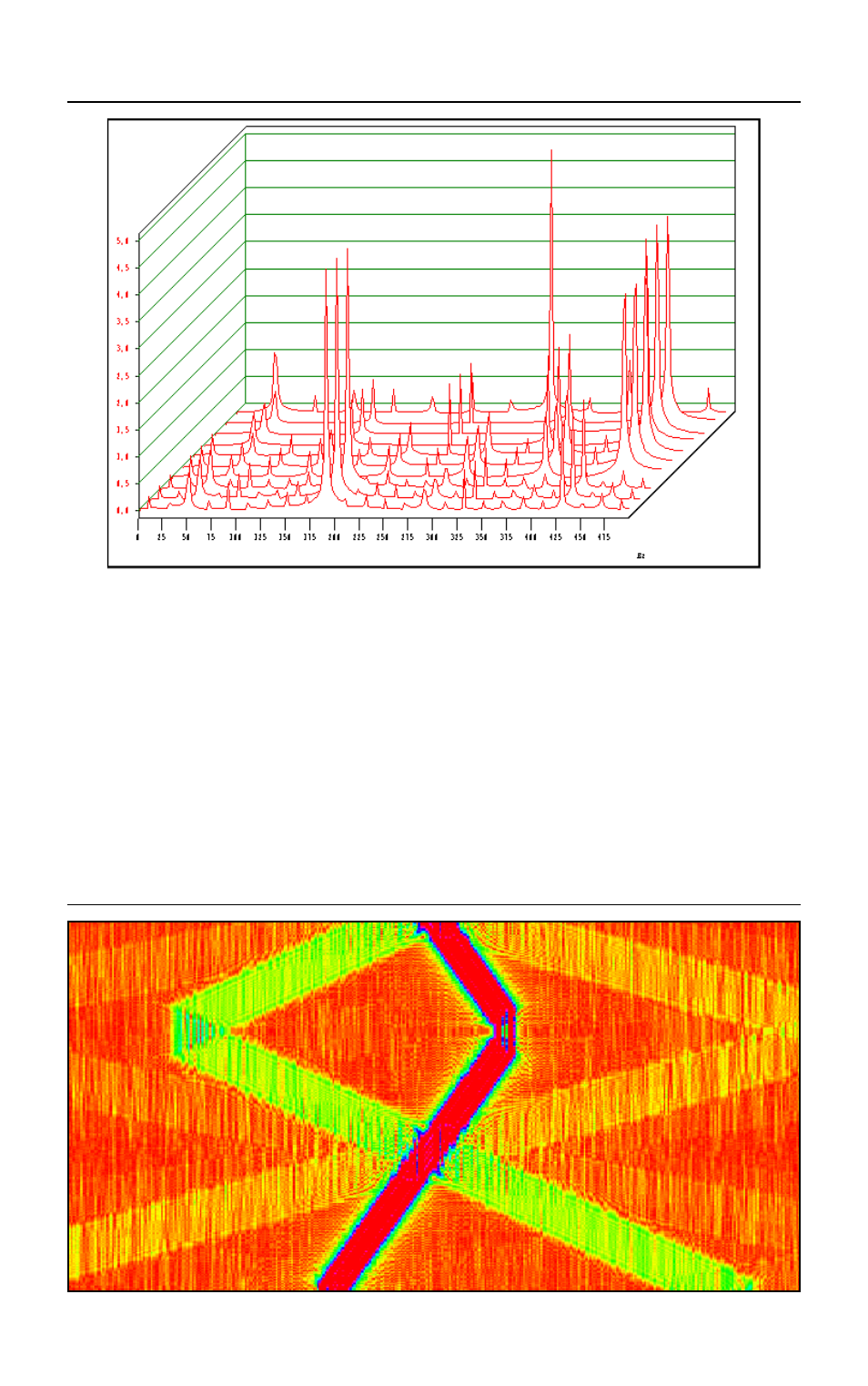
Figure 3-2.
Waterfall Display of an Online FFT
The color sonogram, which is similar to the temperature maps of the
meteorologists, displays the first data channel that is connected to the
Y/t chart in a color sonogram. To do so, the Y/t chart divides the data into 256
classes so that each class covers a specific value area. The Y/t chart assigns
a color to each class. In Figure 3-3, high values are red and the low values are
blue. The color sonogram plots the color values for each data block rowwise
from bottom to top, so that the current color values are at the bottom and the
oldest color values are at the top.
Figure 3-3.
A Color Sonogram Displays Data as Colors. The Bottom Row
Displays the Current Data Block.