Furuno NATVET 1824C User Manual
Page 179
7. CUSTOMIZING YOUR UNIT
7-18
CHART CONFIGURATION menu description (con’t from previous page)
Object Content
Setting
Description
ON
Shown on plotter and overlay
displays.
AUTO
Chart border lines are shown for
the last four charts in a chart
card on the plotter and overlay
displays
PLOTTER/
OVERLAY
Chart border lines show on
plotter and overlay displays.
PLOT
Chart border lines show on
plotter display.
CHART
BOUNDARIES
Chart boundary lines
OFF
Chart boundaries are turned off.
ON
Mixing is active.
MIXING
Changes chart scale to fit
whole chart on display
OFF
Mixing is disabled.
LOCK
Keeps current chart scale.
CHART
LEVEL
Maintains current chart scale
regardless of zoom setting
UNLOCK
Chart scale may choosen freely.
PLOTTER/
OVERLAY
Value-added data shown on
plotter and overlay displays.
PLOTTER
Value-added data shown on
plotter display.
VALUE-
ADDED DATA
Show/hide the "Conservation
Area" for *Australian waters.
(*Contact Australian authorities
for details.)
OFF
Value-added data is disabled.
PLOTTER/
OVERLAY
Camera icon shown on plotter
and overlay displays.
PLOTTER
Camera icon shown on plotter
display.
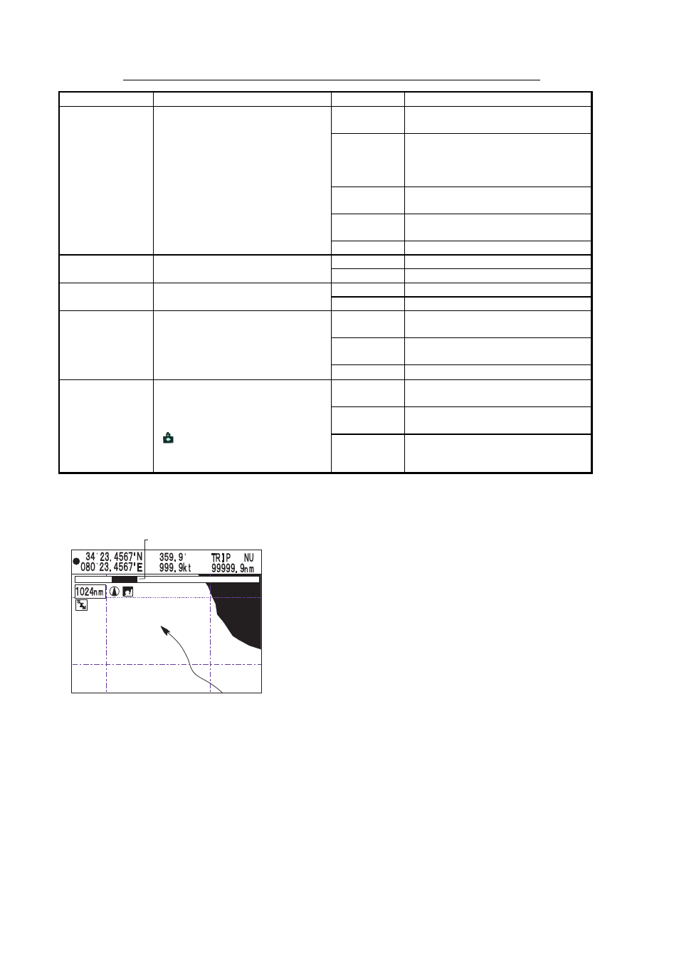
CAMERA
ICON
Show/hide camera icon, which
is used to display an image
from icon location. To display
an image, choose camera icon
( ), push the ENTER knob
and then press the IMAGE soft
key.
OFF
Camera icon is disabled.
*
1
SAFETY STATUS INDICATION
The following indications are shown beneath the range indication to denote safety status:
SAFETY STATUS indication
NORMAL
BEST MAP
DATA OFF DE-CLUTTER DANGER
NORMAL (or U.ZOOM or O.ZOOM):
This indication appears to help you select a suitable chart scale.
NORMAL: Suitable chart scale is selected.
U.ZOOM: Chart scale is too small.
O.ZOOM: Chart scale is too large.
BEST MAP: Shown in red when the unsuitable chart scale is selected.
DATA OFF: Mixing levels can be turned on when the electronics chart coverage area
does not provide enough coverage to completely fill the display screen. When the
cursor or own ship mark is placed in the area with coverage, the chart data is shown as
below.
On: The chart line in the area with no coverage is shown. This area is filled with dots.
Off: The area with no coverage is not shown (goes to white).