Jitkit plot, Jitkit plot types, Plot – Teledyne LeCroy JitKit User Manual
Page 14
JITKIT Software
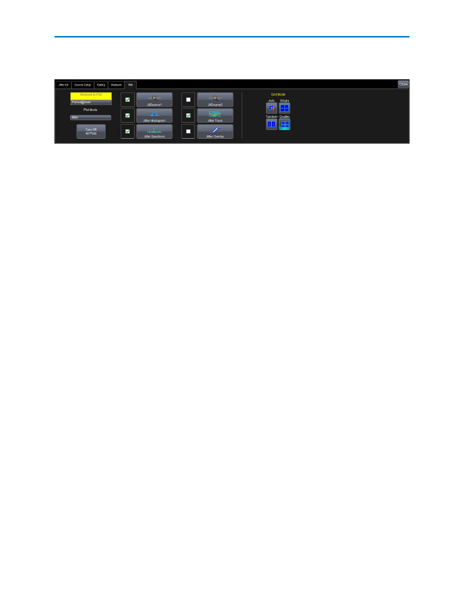
JITKIT Plot
You define the plot and grid modes on the Jitter Kit Plot dialog.
JITKIT Plot Types
You can choose to display any of the following types of plots:
JitSource1 and JitSource2 - These traces are replicas of your channels, but they also have the ability to be
easily and automatically time synchronized with the Jitter Track (JitTrack). They also provide the
convenience of using two inputs of a differential signal to the oscilloscope and having one trace without
needing to separately set up a math function to perform this activity.
Jitter Histogram - Histograms allow you to see how a parameter's values are distributed over many
measurements. They do this by dividing a range of parameter values into sub-ranges called bins. A count
of the number of parameter values (events) that fall within ranges of the bin itself is maintained for each
bin. After a process of several thousand events, the bar graph of the count for each bin (its histogram)
provides a good understanding of the distribution of values. Histograms generally use the 'x' axis to show
a bin's sub-range value, and the 'Y' axis for the count of parameter values within each bin. The leftmost
bin with a non-zero count shows the lowest parameter value measurements. The vertically highest bin
shows the greatest number of events falling within its sub-range.
Jitter Track - Tracks allow you to understand how a measurement value is varying in time, and to easily
time correlate an unusual measurement value(s) with another waveform, which could be your clock or
data lines, or something else, like a power supply line or another signal on your board near the clock or
data signal. Tracks display a measurement value on the Y-axis and time on the X-axis. When there are
thousands of measurement values, it can seem that the Track is a solid trace, but in fact, it is composed
of many discrete points. Jitter Track is different from the normal Track since, by definition, it is displaying
jitter values on the Y-axis instead of directly displaying a measurement parameter value.
Jitter Spectrum - The Jitter Spectrum is essentially an FFT of the Jitter Track with additional capability to
locate and annotate peak values automatically. It shows the frequency distribution of the jitter with
magnitude plotted on the Y-axis and frequency plotted on the X-axis. Oftentimes, high jitter is due to a
nearby interfering signal that has a specific frequency characteristics (e.g. a switching power supply with
an 80 kHz switching frequency). By viewing the Jitter Spectrum, knowledge can be gained that can lead to
the source of a jitter peak.
Jitter Overlay - One of the most basic ways that engineers think of jitter is as a variation in a horizontal
clock position that they can view on an oscilloscope display. This can be created by triggering on a rising
or falling clock edge, setting the timebase to be ~1 period, and turning on infinite persistence. This simple
method of viewing jitter has two significant drawbacks:
l
Jitter in the oscilloscopes trigger circuit is included in the persisted display, which can lead to erro-
neous conclusions about how much jitter is really present.
l
It is not possible to view more complex jitter behaviors such as phase (TIE) or cycle-cycle jitter.
12
922810 Rev A