Character spacing, Quality, Orientation – Rena DA615 User Manual
Page 53
Fonts
\text\etd\DA615\font
7.4
DA615 instruction manual
Character spacing
To bring single words out more clearly, you can expand the spacing
between letters and words without changing the character size
itself.
This E x a m p l e is printed with expanded
spacing.
Quality
The term quality refers to the quality of the printout.
150D
Use 150D for fast printing with low ink consumption. This
corresponds to a pitch of 150x150 dpi (dots/inch).
300F
Use 300F for your standard correspondence. This mode makes
use of the maximum pitch of 300 dpi (dots/inch).
600D
Use 600D to obtain an enhanced appearance for your
correspondence. This mode makes use of the maximum pitch
of 600x600 dpi (dots/inch).
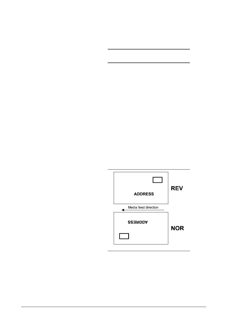
Orientation
Orientation refers to the (readable) address position on the paper. It
may be rotated by 180°.
Note the specifications relating to image memory capacity in the
“Orientation“ menu on page 5.8.