Input> element, Input> elemenet details – Grandstream GXP21xx XML Application Guide User Manual
Page 24
FIRMWARE VERSION 1.0.4.23 GXP21xx XML APPLICATION GUIDE Page 24 of 36
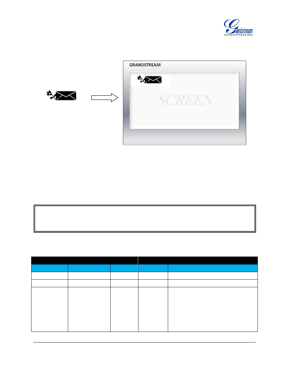
The above example will render the following picture to be displayed on the top-left corner (X: 0, Y: 7) of the
screen.
ELEMENT
This element is to render input fields on screen so that users could enter necessary information to submit
or proceed.
ELEMENET DETAILS
Object
Position
Type
Values
Comments
input
Element
Optional
-
name
Attribute
Mandatory string
A unique id for the input field
value
Attribute
Optional
string
Input field value
type
Attribute
Optional
"text"
"password"
"hidden"
"radio"
"checkbox"
"text": the input digits will display as it is;
"password": the input digits will display
as * after 2 seconds idle time or different
key pressing;
"hidden": the input digits will not display
but the value can still be sent to the
Input Name
" value="
Value
" type="
text
" maxlength="
Max Length
" data-type="
int
">
" pos_y="
Y location
" height="
Height
"/>