DgFlick IDCardXpress User Manual
Page 44
User Manual-2.0
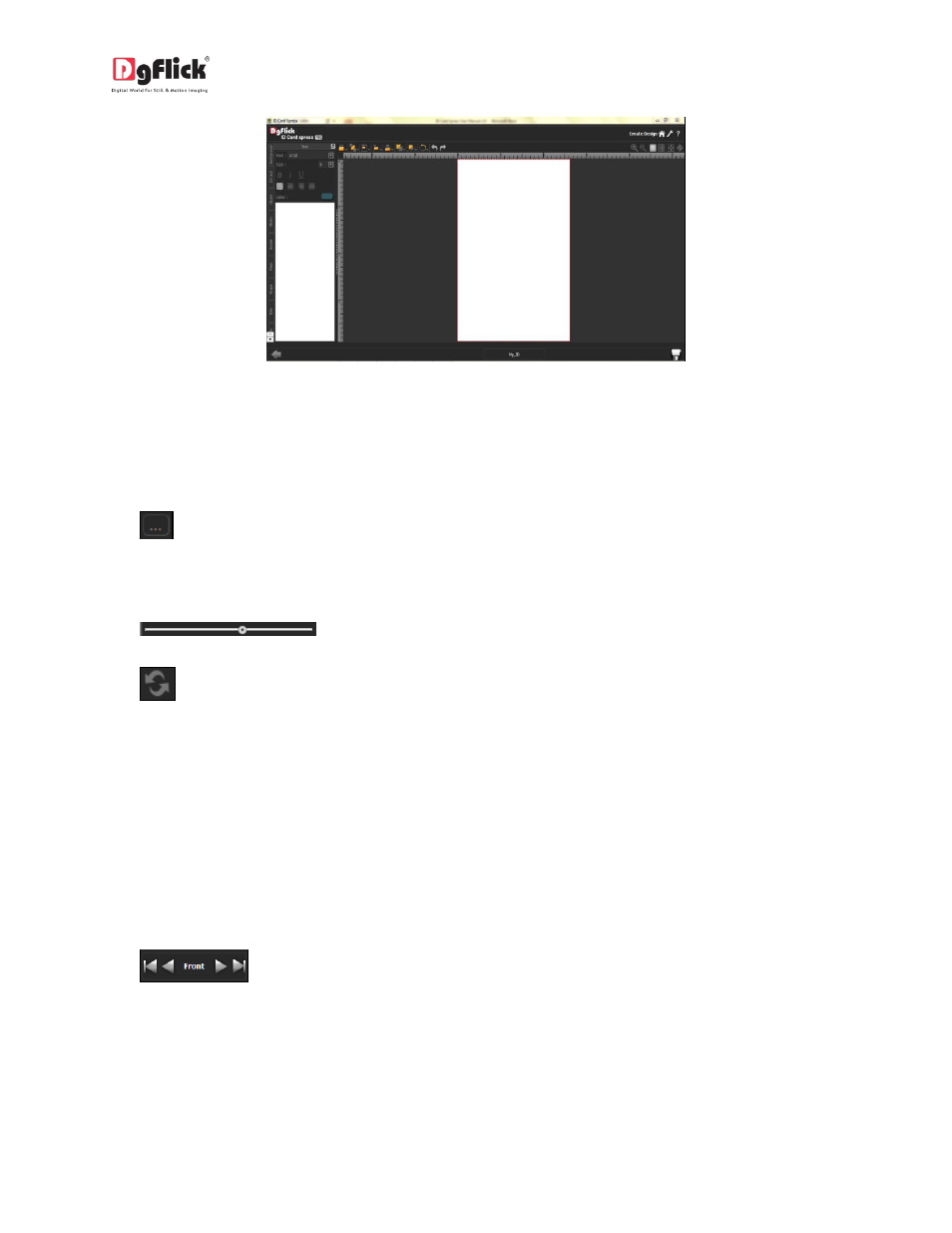
Image 3.2.3.7: ‘Create Design’ Window
Before starting with the actual Design process, let’s have a look over the common features and tool bar
which will help you to Design your ID Card more easily.
Common Features;
: This lets you change to the path of your choice to select photos, backgrounds, clip-arts,
borders and masks. In most instances, the last 15 paths accessed will be displayed for use and
reference, once this option is selected.
: Can be used for adjusting thumbnail sizes.
: Can be used to reset the changes done.
Color Indicator on the Photo: On clicking the ‘Photo’ tab on the left of the screen, the photos to be
used is displayed. A green tab indicates that the photo has been used on another page. A blue tab
indicates that the photo is being used on the current page. The number in the tab indicates the
number of times the photo has been used.
Ruler: Horizontal and vertical rulers are available to help align photos on the page. The rulers can be
seen on the top and left of the page and can be activated by clicking on them. The rulers can then be
dragged onto the page and photos can be aligned against them.
: This helps one to navigate through the front and Back sides of the ID Card if you
choose Duplex ID Card Design.
Photo Quality Indicator: The quality of photos used must be good to ensure clarity in the final
product. ID Card Xpress has an in-built ‘Quality Indicator’, which warns you whenever the photo
quality goes below the required standards.