Extron Electronics IN1776QZX User Manual
Page 17

15
©1999 - INLINE, INC.
IN1776QZX OPERATION MANUAL - REV 1.4 11/27/99
15 TIPS FOR HAPPY SCAN CONVERSION
Preview the Scan Converted Image
The best way to ensure a good scan converted image on a conventional video screen is to connect
your computer to the IN1776QZX and view the image displayed on the conventional video
monitor before you begin your presentation. This will let you select the colors that look best on
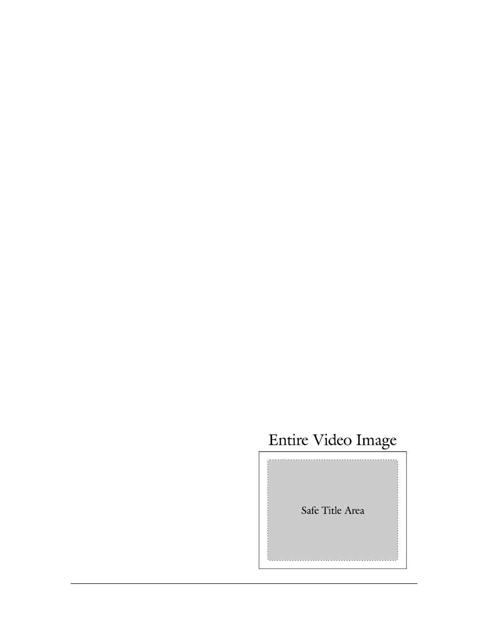
the video screen, determine the appropriate text size and help you stay within the “safe title
area.”
Choose Colors and Backgrounds Carefully
You may notice that intense colors and many shades of red often look bad on the conventional
video monitor, whereas pastel shades, blues, greens and grays provide a more pleasing image.
Solid backgrounds are usually better than gradations and patterns. If you are creating an on-
screen presentation to be viewed through the scan converter, select a color scheme and
background which provides the best contrast and readability. Most presentation packages offer
several templates that define background hues and the colors of headlines and bullet types.
Before demonstrating software programs, view the scan-converted image to select color settings
that look best on the TV monitor. The Windows and Macintosh operating systems let you
choose the overall color scheme that sets the colors of window borders, title bars, menu text and
other small items. Remember that some viewers may be located far from your video display, so
you must select the best colors in order to enhance their ability to see illustrations, icons and
other detailed information.
Use
BIG
Fonts
You may enhance the readability of your presentation by using the largest font size possible.
Headlines should be at least 36 points, bullet points should be at least 24 points and body text no
smaller than 18 points. For best visibility on speaker support slides, try to limit yourself to no
more than five or six lines of text and no more than 25 words per screen.
When demonstrating software you may increase visibility by selecting a sans serif font such as
Arial or Helvetica for menu bars and increasing the font to a larger size. If there are parts of the
screen which cannot be changed (i.e. viewing a document or spreadsheet with small text) use the
ZOOM button to enhance visibility.
Don’t Go Near the Edge!
Remember that conventional video monitors
usually don’t display the entire picture from edge
to edge since they overscan by at least 5% to 10%.
This means that anything located at the extreme
edge of the screen may be cut off. Since the
amount of overscan varies from monitor to
monitor it is generally best to avoid the outer
edges of the screen when placing important
headlines, logos and other critical items. Be sure
to view the presentation on your conventional
monitor to ensure that you are staying within the
safe title area.
