Control bar – Biamp LTR User Manual
Page 52
daVinci Printed Doc
Control Bar
Control Bar
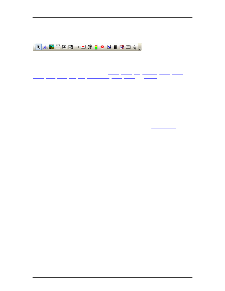
Toolbar icon names appear when the mouse is positioned over them.
The Control Bar allows individual controls to be placed into the Surface. These controls are
categorized strictly by available control types:
;
;
;
,
;
.
Each control type is represented by an icon. To place an object, first click on the appropriate
icon, then simply click at the desired location in the Surface. With certain control types, this will
produce a pop-up window of configuration options, which must match the component being
controlled. Then,
must also be assigned to match the component being
controlled. NOTE: Components may instead be copied from a compiled Audia or Nexia design
file, and pasted directly into the daVinci Surface, eliminating the need to manually set component
options and Data Attributes.
The Control Bar also provides the option of either a select cursor or a text cursor. The select
cursor (default) is for object selection, placement, and manipulation. The text cursor is for placing
static text objects into the Surface. Text can then be manipulated via the
Toolbars are opened/closed and customized via the
desired.
50