Crystal reports, Occurrence bar charts, Period line charts – ACTi Queue Management Server 1 User Manual
Page 38: Acti queue management server 1 user’s manual
ACTi Queue Management Server 1 User’s Manual
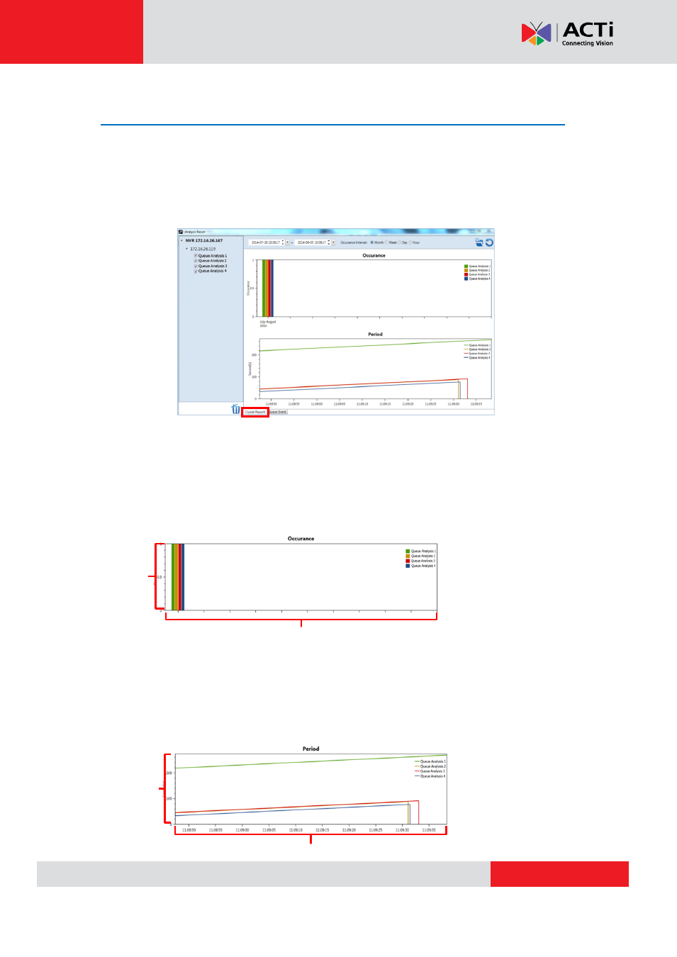
Crystal Reports
A Crystal Report provides graphical representations of analysis results in the form of bar
charts and line graphs. To view the Crystal Report for your analysis, make sure that you have
selected the “Crystal Report” tab at the bottom of the window. The Crystal Report will provide
2 data charts: Occurrence and Period.
Occurrence Bar Charts
Occurrence Bar Charts provide an overview of how many events have been detected by
each algorithm. The x-axis describes the time at which the analysis took place, while the y-axis
marks how many events were detected. You can adjust the time scale by placing your cursor
on the graph and using the scroll button.
Period Line Charts
Period Line Charts provide an overview of how long the events detected by the analysis took,
or how long the waiting time was. The x-axis describes the time at which the analysis took
place, while the y-axis shows the time passed in seconds. You can adjust the time scale by
placing your cursor on the graph and using the scroll button.
N
u
mbe
r
o
f
e
v
e
n
ts
d
e
te
c
te
d
Time
Time
Tim
e
p
a
s
s
e
d
in
s
e
c
o
n
d
s